Styling & Theming
Customize the look and feel of your forms with themes, colors, banners, and typography options.
Theme Templates
Choose from 6 standard themes included with the free tier. Pro users get access to 7 additional live animated themes with dynamic backgrounds.
Accent Color
Use the color picker to set an accent color that applies to buttons, progress bars, and highlights throughout your form.
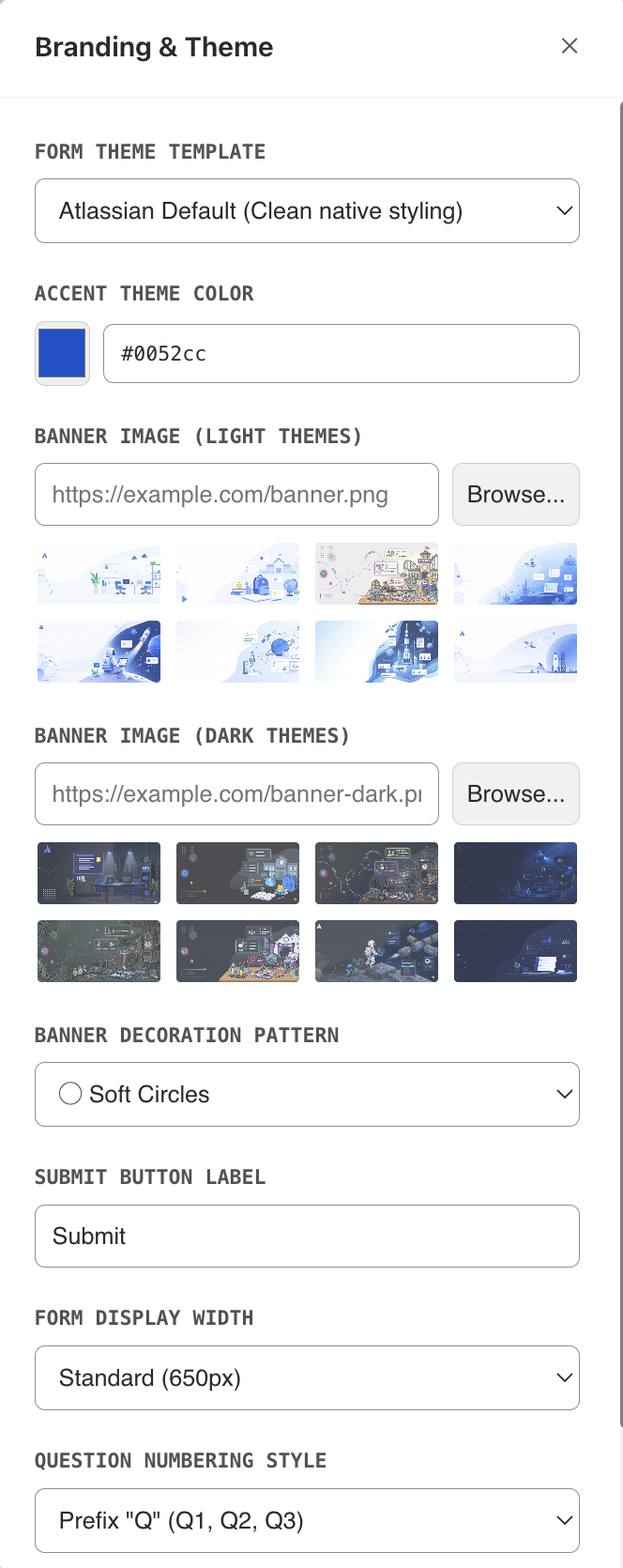
Banner Images
Pick a banner from the built-in preset gallery — there are separate sets for light mode and dark mode viewers. Each respondent automatically sees the variant matching their own Confluence theme.
- Choosing a preset auto-selects its matching counterpart in the other mode, so both are always covered.
- Pick None to fall back to a gradient banner in your accent color, with an optional decoration pattern.
Success Screen Icon
In the Success Screen panel, choose the icon shown after submission: one of the built-in drawn icons (checkmark, trophy, star, heart, rocket, and more) or any emoji from the picker. A custom completion image, when set, takes precedence over the icon.
Banner Decorations
Add decorative overlays to your banner: circles, diamonds, waves, dots, or none.
Typography & Layout
Select from available fonts, adjust form width (standard, wide, or full), and choose a question numbering style to match your brand.